

Data Dashboard Access
Below are the basics on accessing and using some of the IR dashboards. Please note that you’ll need employee level access to follow these instructions.
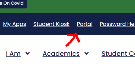
- Navigate to the portal at the top of the website. You will need to need to provide your employee credentials if you aren’t already signed in.
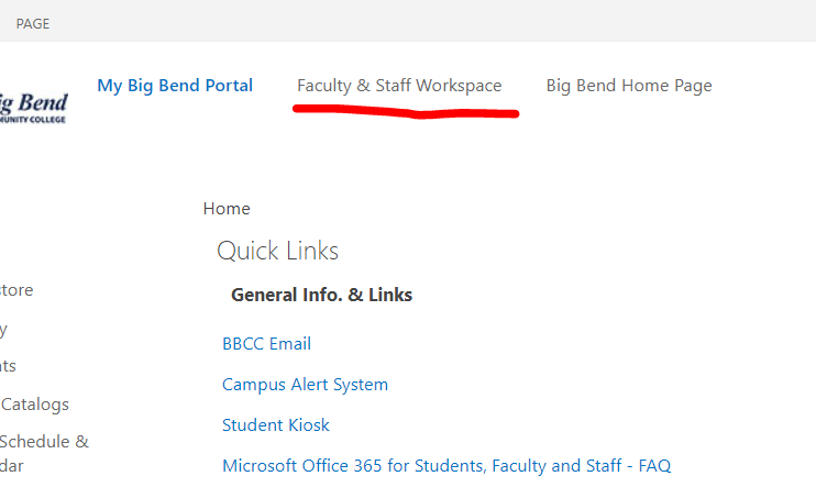
- Navigate to the “Faculty & Staff Workspace” tab near the top left.
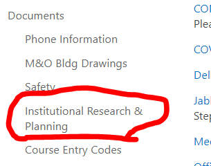
- Navigate to the “Institutional Research & Planning” link on the left under “Documents”.
- From this page you can see a variety of IR and state dashboards.
BBCC Quick Facts Dashboard
The BBCC Quick Facts dashboard is provided by the IR department and is updated yearly with state provided data. There is a variety of useful data available through the dashboard regarding our student’s demographics, the course/department success rates, enrollment, credential earnings, and more. This dashboard is intended for internal use.
Notes:
- Most of these sheets have a filter reset button. If you’re not certain on the results, you can always reset the filter to start fresh.
- Some of these sheets have “Breakout by” options for some charts. Using this you can see more lines in the line charts displaying different categories for comparison. For example, you could breakout by quarter to see success rates for Spring as compared to Fall. This is especially useful when you want to combine filters together while maintaining comparison groups.
Quick Facts:
The “Quick Facts” sheet provides an overview of the student body. This covers student intent, demographics, and headcount. There are a few filters at the bottom right that can be used narrow the results, be aware of which ones are set when viewing the visuals. This sheet is best used when viewing one year at a time, but when selecting multiple years it aggregates the data together. Hovering over different visuals can provide more details on number values as well as other clarifying information.
Where are our student from?:
The “Where are our student from?” sheet provides a map showing where some of our students are from with the orange circles indicating locations within our service district and blue circles indicating locations outside the service district. There are a few filters available including a city search for selecting specific cities. Hovering over the circles provides additional demographic and headcount details where available (some data is hidden for data privacy).
FTE:
The “FTE” sheet provides a 10 year view of FTE (Full-Time Equivalent=12+ credits per quarter) enrollment and student to faculty ratios. By default this includes all of the departments, but can be filtered down to show fewer for clearer comparisons (especially when combined with the “Breakout by” feature).
Overall Success Rates:
The “Overall Success Rates” sheet provides a bar chart and a line chart that show an overview of the course success rates over the selected years. This sheet can achieve a great deal of granularity with it’s many filters and the “Breakout By” feature. You can filter on academic year, quarter, department, course, section code, modality, Running Start status, age group, race/ethnicity, sex, and First Generation status. These can be combined with the “Breakout By” feature to get a visual comparison of different categories. For example, you can filter to show males and pre-college level courses combined with the quarter breakout to see which quarters they did better at.
It is worth noting that some of the filters remove options depending on the selection. For example, if you select courses that aren’t taught in the Summer, the Summer value won’t show in the quarter filter. The academic year and department filters will always show all of the possible options.
Course Success Compare:
The “Course Success Compare” sheet provides much of the same information as the “Overall Success Rates” sheet, except it shows two line charts while moving the bar chart somewhere else. The two line charts offer a comparison between two different selections of departments and courses. You can select the departments and courses to compare against with the filters at the bottom right. The other filters affect both bar charts. The bar chart has been moved into a tooltip shown on hover. Simply hover any data point in the line chart to show the breakdown (it may take a moment to load).
This sheet allows broad comparisons between departments or granularity with specific courses.
Department Profile:
The “Department Profile” sheet provides a line chart that shows the student headcount for different programs over the years. You can filter on academic year, race/ethnicity, sex, and age ranges, which can provide a granular view into a programs profile.
You can also use the ”Breakout by” option to get headcounts for different groups (eg. headcount by race/ethnicity). Be aware that this chart does exclude AS-DTA and no-program students and the values do not represent our total student headcount for those years.
Credentials:
The “Credentials” sheet provides a table and a line chart. The table shows the number of credentials earned by each degree or certificate for each year. The line chart shows the same information, but groups the credentials into broader categories (eg. Associate of Arts, Associate of Science, 1-19 credit certificate). You can filter on academic year, general degree type (a grouping of programs where possible and specific degrees/certs otherwise), award type, degree/certificate title, race/ethnicity, and sex. You can also use the ”Breakout by” option to get the number of credentials earned for different groups (eg. number of certificates by race/ethnicity). Combining the filters and the “Breakout by” option, you can get very granular results on what credentials were earned for the different years.